Happy Circles II – A new pattern

YAY – my Happy Circles cushion cover is finally finished! – Okay, to be honest, it has been for over a week now.
Unfortunately, it took me a very long time to write the pattern. Like other countries in Europe, we had a terrible heatwave here. The temperatures climbed up to 40 degrees Celsius. And this was definitely too hot for my brain. I found it hard to concentrate on anything.

But now the time has come. Everything is written down and hopefully well explained!

You can download the free pattern here

If you have any questions about the pattern (or spot any mistakes), simply email me. You can either use the contact form or email me directly under hookedonhakelmaschen@gmail.com
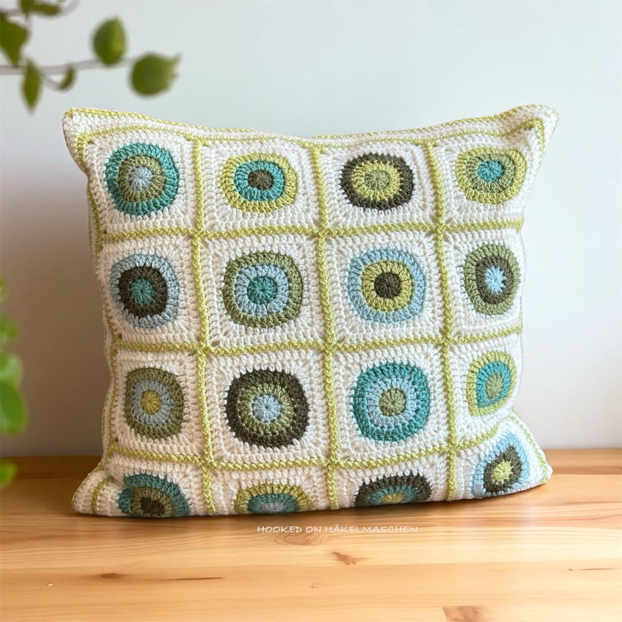
The Design

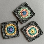
The cushion cover is designed for a 50 x 50 cm (20 x 20 inch) cushion. The finished size is about 46 x 46 cm (18 x 18 in).
With the size I followed an advice I found on the internet. It said that to make a square cushion look nice and plump, the cover should be about 5 cm (2 in) smaller than the cushion.
At first I was unsure whether this would really work. And when I finally put the cushion into the cover to close the last seam, I was pretty sure at first that it had become too small. But everything turned out well in the end. I am totally happy with the result!

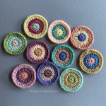
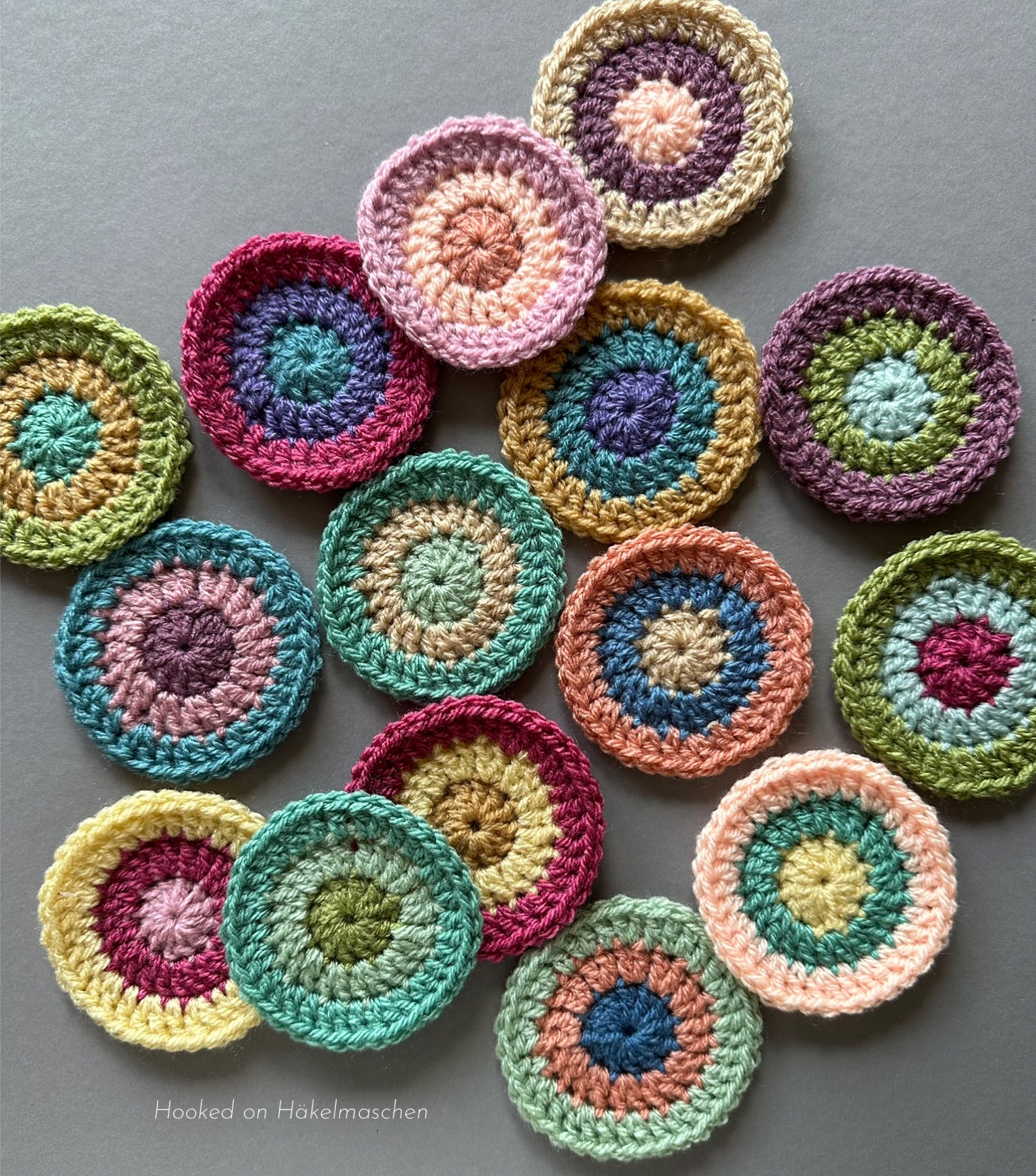
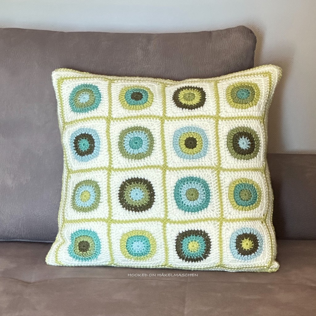
The front part of the cover is made up of 16 squares, arranged in a 4 x 4 layout. Each square measures about 10 x 10 cm (4 x 4 in).
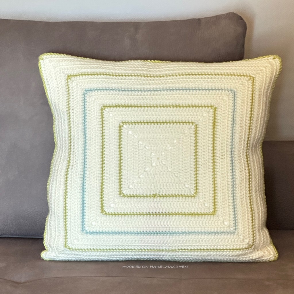
For the back, I opted for a simple square. Mainly single-coloured, with a few small contrasts.

The size is easy to adjust by enlarging or reducing the border of the front piece. The rounds for the back must then of course be adjusted accordingly.

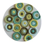
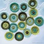
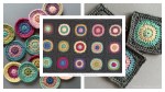
My Colours and Colour Placement

My colour choice was inspired by a cushion cover I got from IKEA some years ago.

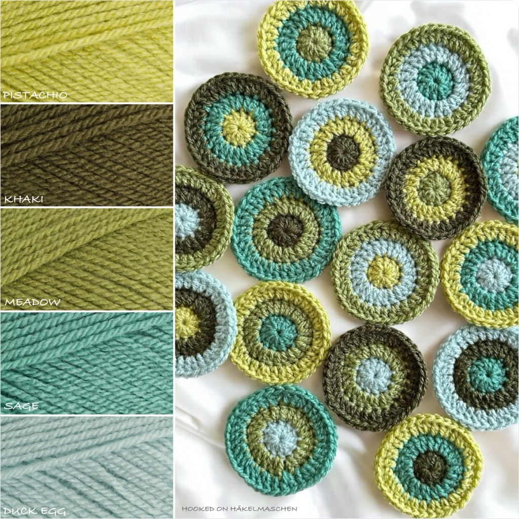
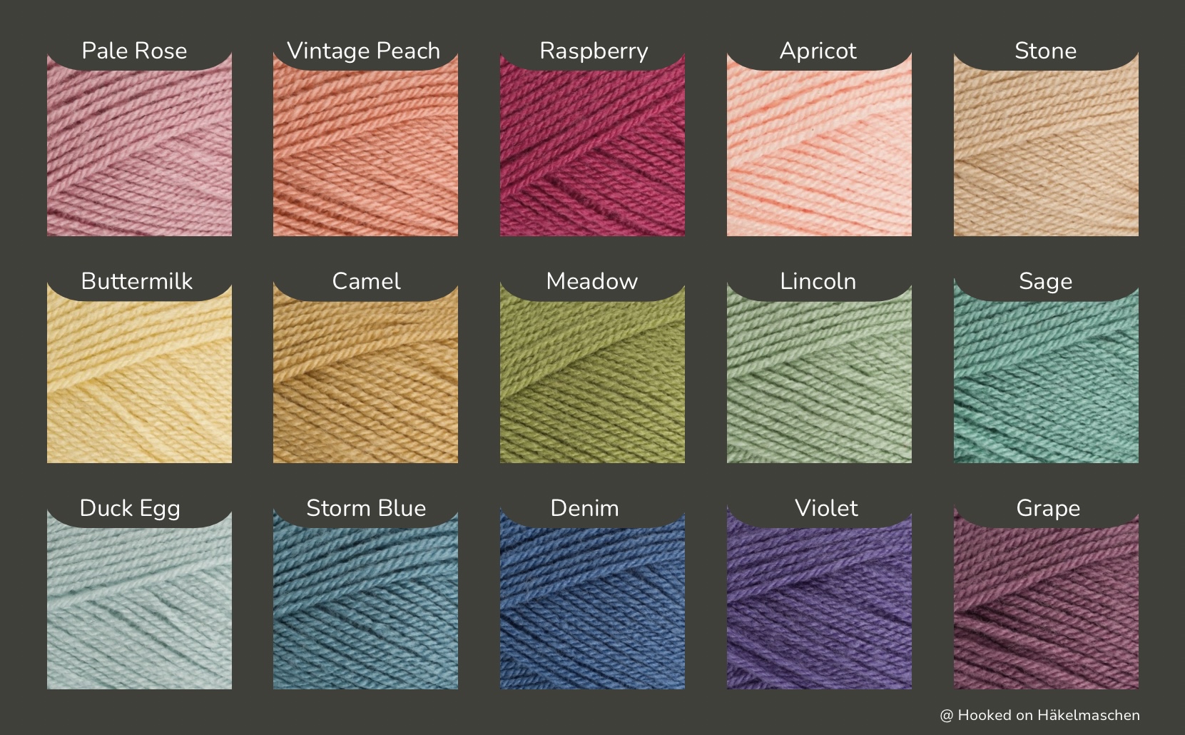
I selected five colours from my Stylecraft Special DK stash focusing on yellow-green and blue-green tones.

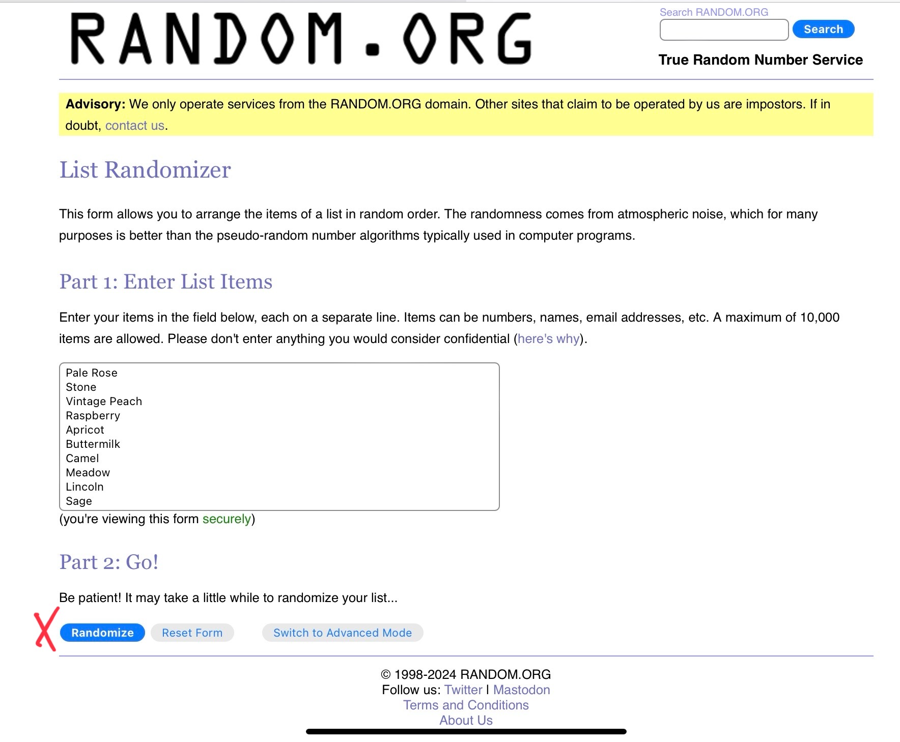
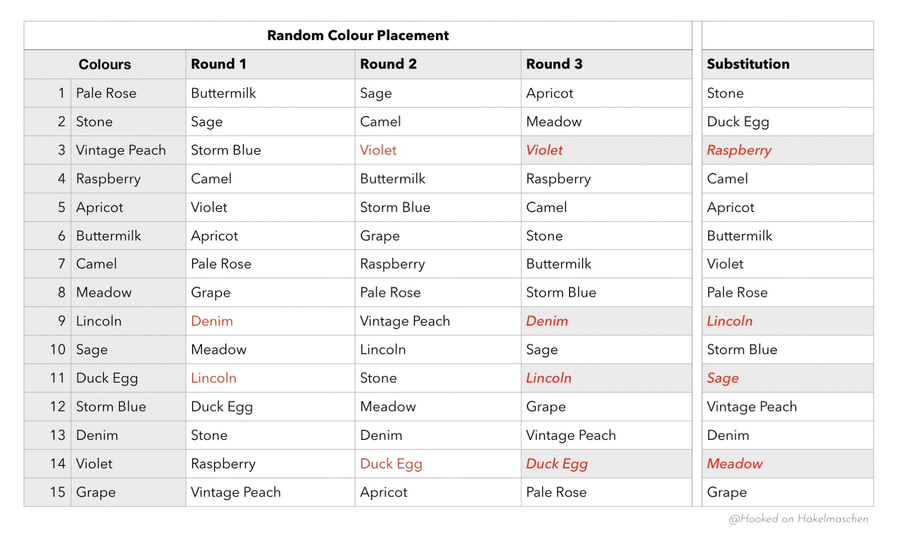
Originally, I wanted to create a random colour scheme for the design again. This time, however, I failed with the use of the random generator. I didn’t like the results, so I worked out something of my own. The outcome is not really random, but has a similar effect. You can read all about it in one of my earlier posts.

Of course, you can also use different yarns and/or different colours. But please bear in mind that using a different yarn may affect the size of the finished cushion. It may also change the quantity of yarn required.

I am totally happy with the result! And I hope you like it just as much!

Related Posts

I needed a bit of colour – Colour Experiment Part 1

Experimenting with Random Colour Combinations in Crochet

Lately I’ve been having incredible difficulties putting together the colours for a project. Ok, that’s never really been easy for me. But I’ve never found it as difficult as at the moment. I thought about making a new Gretchen but I am not even able to find two colours that would work together ant that I like. It feels like I’ve already used every colour combination before – I can’t think of anything new.
Maybe I just need to step out of my comfort zone and opt for colours I don’t normally use? Yes, maybe, but that’s really difficult!

Anyway, this gave me the idea to experiment a bit with colours and try something I’ve wanted to try for a long time

Random colour placement

I’ve read about it several times, but I’ve never gone into it in depth.

If you crochet simple shapes – such as grannies, circles or triangles and so on – and work with a lot of colours, there are countless ways to arrange these colours. And – you have probably noticed that too – you can achieve different effects with the arrangement of the colours. In my eyes a colourful granny blanket, for instance, looks best, when the colours are randomly put together. But how to achieve this?

To obtain random colour combinations, you can of course first list all possible combinations of the colours you are going to use. The easiest and best way to do this is probably with an Excel, Numbers, or Google spreadsheet. But I am afraid this can also get complicated. For instance: assuming you make a motif with 3 rounds, each round in a different colour (which should only appear once), and you use 5 colours, then there are already 60 possible colour combinations. The more colours and/or rounds, the more complicated the list becomes.

I haven’t tried this yet, so it’s just theory. But beyond that, I wonder what would happen if I couldn’t use all the colour combinations for my project. I would probably choose the ones I like best. Would that influence the overall impression?

However, I wanted to try something different for a random colour combination. I had read about a website that has a random number generator: random.org. They offer different services, including a list randomizer.

For my colour experiment I had thought about crocheting circles. Each circle with 3 rounds in different colours.

My colours and the random outcome

I picked up some of my little balls of leftover yarns and added some colours from my stash that I had never used so far, such as Stone, Camel, Lincoln and Violet. In the end I had these 15 colours that I thought might look good together.

All colours Stylecraft Special DK

I listed all colours in a Numbers spreadsheet (shown in the picture below, first column). Then I copied this list to the list randomizer in random.org.

After hitting the button ‘Randomize’ I had the first result in no time – all my colours listed in a random order.
I copied this result back to my Numbers sheet, filling the column for Round 1 (see picture below).

Hitting the button ‘Again!’ in the randomizer and gave me another random list of my 15 colours. I copied this result back to my Numbers table filling the column for round 2.

Then I repeated this step once more to get the colours for round 3.

This way I got 15 unique colour combinations.

Unfortunately I had to realise that, based on the result, some colours would appear twice in one motif. Since I didn’t want this to happen, I repeated the steps described above a fourth time and entered the result in the ‘Substitution’ column. Now I was able to replace the duplicate colour with the substitution colour.
For example: instead of Storm Blue, Violet, Violet I used Storm Blue, Violet, Raspberry.

My Numbers Spreadsheet

When crocheting, I strictly followed my list and this is the surprising result:

To be honest, I was VERY surprised at the result. There are colour combinations that I would never have put together myself. Nevertheless, I think every single one looks absolutely beautiful!

Afterwards I repeated my random selection – same steps as described above – and crocheted another 10 circles. You can see the result in the cover photo above. Here, too, I was not disappointed by a single one!!

My 25 circles are meanwhile all turned into squares. I used Stylecraft Special DK in Graphit as I thought a dark colour would showcase the colourful circles best.

Yep – a lot of tails to work away, but all done! My squares could do with a bit of blocking though. But so far I am very happy with my experiment!

Now I will have to think about the best way to join them AND what to do with them once they are joined. I can imagine either a wall hanging or a cushion cover. I’m not sure yet …

Anyway, I will let you know. And of course I will provide some information on how I made the circles / squares and what my layout looks like!

See you next time 💕

New page on my blog – Colour Boards

I have just added a new page to my blog: Colour Boards.

Some time ago I already told you about how I am trying to put together colours for a new project and how I try to compensate for the lack of a yarn shop nearby. (You can read about it here.)
I am still working with the digital yarn patches from the Stylecraft website and my „hardware“ colour swatches. But I also started to create something new. New for me at least!

I have been collecting mood boards and colour combinations that I like for a long time. I often use them when I’m putting together colours for a new project. For me they are always a great way to get started. But I have never tried to translate a certain atmosphere that I like in a picture into yarn colours myself. Until now!

I came to this when I was checking the files for Ana’s Costa Nova Cal. The first colours that spontaneously came to mind were what we call navy colours: dark blue, red and white. But then I asked myself which colours – apart from the navy colours – could also represent the summer? Summer, sun, beach, what do I associate with it? And I found myself looking for some photos that call to me. And voila, I created my first colour board based on a picture and a certain atmosphere.

If you follow my blog you have probably already seen some of them in my post about the Costa Nova Cal. But meanwhile I created some more and collected them on a separate page. I am sure new ones will follow.

I hope you like them and find them inspiring!

How do you choose colours?

How do you choose colours for a new project? Do you like to go to a yarn shop and hold the balls to each other? Do you have colour samples of your favorite yarns?

I love shopping in yarn shops but unfortunately the DK yarns I like to use for my blankets are not available in my local shop. So I mostly order my yarn online. But ordering online means that you never know how close the colours you see on the screen come to reality. Especially when ordering yarn for a specific project it is more than annoying when the colours are not as you imagined them. I often went wrong!

After several failures I got myself shade cards of my favorite yarns. They helped me a lot! I can now see the colours in reality! And above all I can now better assess how close – or far – the representations on the various websites are to reality.
The disadvantage of shade cards is that they quickly can become outdated as new colours are added (and others discontinued).

And unfortunately you cannot place the colours on a shade card next to each other like you would in a yarn shop. My imagination often doesn’t go so far that I can put several colours together in my head and say whether they look good together or not. With 2 or 3 colours it works quite well, but with 5 or more it is usually difficult.

Virtual yarn balls

With the help of my shade cards I found out that for example the display of colours of Stylecraft yarns is very good on their website (at least on my devices). This has opened up new possibilities for me. I downloaded the Special DK colour swatches from there and am now combining them in an app which I also use for collages.

It is great to play around with. You can easily try out colour combinations, move the patterns around, add or change colours. I love it.

This sample was inspired by a mood board of Pipin Poppycock. I used this combination of Stylecraft Special DK for a – still top secret – project and am very happy of how it turned out.

Stylecraft Yarns has kindly allowed me to publish these swatches, mentioning the brand.

„Hardware“

Unfortunately, it should not be underestimated how some colours change in combination with others. 
Silver, for example. In my Winter Wonderland blanket, in combination with white and other greys, it looks really silver. In the combination shown above, with different shades of apricot and rose, it looks more bluish. At least for me, these effects are difficult to predict on the screen. I can imagine them better when I actually have the colours in front of me, in reality … My lack of imagination again …

That’s why I looked around for other options.

I’m actually really keen on those beautiful yarn pegs that you see everywhere on the internet. But all the ones I’ve found so far are pretty expensive – not for the pegs but for the shipping costs to my country. So I came up with the idea of making a few swatches myself – initially with the colours from my stash.

First I got myself little plastic cards. They are about 3 x 4 cm . I like them, especially as they came in a small box where they can be safely stored.

Unfortunately they only offer little space for labelling. It is difficult to put all the necessary information such as brand, colour number and name on it. I therefore had to use abbreviations for the yarn brand. As my list of shortcuts grew longer and longer I decided to use them only for my thinner cotton yarn.

One day I saw a post by a lady who creates beautiful scrapbooks for her projects. I have unfortunately forgotten her name, otherwise I would credit her here. She had made little crochet squares that she could pin back and forth as she wished. This gave me the idea to do the same to put my colours together – without a scrapbook though.

These squares are also ideal for playing with, trying out and photographing colour combinations and so on. Without having a scrapbook the only problem is the allocation of details such as brand and colour code. At first I thought about labelling each square with a small label so that I could write down all the important details. But somehow that was too impractical for me.

So I switched to wooden sticks. I label them with shade number and name and wrap the thread around them. This is done in no time and there’s enough space on the back of the stick to write down the brand.
Some people might see this as “double”, but it has worked perfectly for me so far.

My pile is growing, even though I’m not finished yet. I had no idea  that I already had so many colours in my stash. Every very time I order yarn now, I pick an extra ball of one or two colours that I don‘t have yet but might use in one of my future projects. I’m well on my way to building up my own collection!