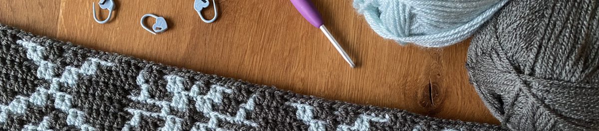
Today part 1 of Ana’s Wintry Forest Cal was released. Lots of fun to all who follow the Cal.
My wall hangers are finally decorated in our living room and I love them, love them, love them.
For those who are interested here some details:
My Colours
Even though I’ve already shown the colours in a previous post, here they are again:
I used
Cream, Mocha, Grey and a little bit of Denim – all from Stylecraft Special DK and Stonewash from King Cole Comfort DK (that‘s the lovely blue on the upper left)
and worked with a 4 mm hook.
You will find detailed information about the colours I used for each row / pattern in my next post as download.
Finally I can show something I worked on for the last few weeks: Wintry Forest.
Wintry Forest is the new Cal by Ana Morais Soares from One Skein of Love. It will come in 6 parts (5 for the blanket and 1 for the border) and starts on November 10th. The Intro File with all relevant information is already available on Ana’s Ravelry page.
When I started testing it about 4 weeks ago I knew right away that I was going to make a wall decoration. But this time the decision about colour was a difficult one. It cost me a lot of time and nerves.
At first I thought about using just cream and grey, but I abandoned the idea after one of my fellow testers used exactly this colour combination. My next idea was to make it colourful, changing background and contrast colour for each pattern. So I picked about 10 or 12 colours from my Stylecraft Special DK and began mixing and matching them. I ended up with a pile of colour swatches but somehow I didn‘t get the colour placement balanced. So I also discarded this idea.
The picture above shows only some of them :D
Nevertheless I will keep my pile of swatches as I found some really nice combinations. For instance I never thought that Mocha and Pale Rose would look that great together. Duck Egg and Storm Blue also are a great combination. Strong but beautiful!
In the end, I came back to my idea with Cream and Grey and decided on a combination of
Cream, Mocha, Grey (Stylecraft Special DK) and Stonewash (King Cole Comfort DK).
I also added a little bit of Denim (Stylecraft), just because I fell in love with that colour and thought that it matches the rest.
The colours remind me on a cold and sunny winter morning. I love them!
I separated the pattern (10 different designs) into three parts and am just framing my panels with borders and make some tassels.
Hopefully I will be able to show you my completed decoration next week when the Cal starts.
I fell in love with this pattern the first time I saw it and knew immediately that I had to make it. I started it in January 2021 and no, it is not finished yet. Why?
Well, it all began with the photo above. I was writing a blog post about the projects I am working on besides testing. Mainly the Seashell Dudes by misssBerlin and When Summer turns into Fall. Since both of these projects were not very far along, I had the idea of using the cover photos of the patterns to show how they will look when finished. I therefore decided to contact the designers and ask for permission. Having worked with Dana (misssBerlin) several times before, I was sure she would agree. But I had no idea how Ana would react. Nevertheless, I simply wrote her an email. And that’s how it began! Her answer was not long in coming and of course she agreed that I could use her photo. But she also asked me if I would like to test for her once. Guess what I answered! So I found myself testing her Gretchen, the Geometrics and many more …
It is an amazing journey and I have made a wonderful friend! Only my When Summer turns into Fall has slept peacefully in a bag so far. But I will now take the opportunity of the MAL to finally get on with it! It is such a relaxing pattern and fun to work on. Wish me luck!
Sorbet is the latest pattern from Ana Morais Soares from One Skein of Love. I had the pleasure of testing this beautiful design during May 2022. The original blanket was made with a colour-changing yarn, Hobbii Twister. It’s a Cotton / Acrylic blend in sport weight. The blanket features three different patterns, and the instructions include three different layouts.
I decided to use only single-coloured yarn. I wanted to use up some of my stash, though, so I used some of my DK yarn. A mix of Stylecraft Special DK and King Cole Baby Comfort DK.
Originally, my blanket was supposed to be 90 x 130 cm in size, just like Ana’s version. I must have miscalculated! To achieve that, I would have needed two more repeats across the width. My blanket is now only 80 cm wide, so I’ve shortened the length a little too. For me, at any rate, it’s the perfect lap blanket. The colours go perfectly with my living room and will also go well with my – er, with my husband’s ‘Midnight Snowflakes’ (if they ever get finished).
The Hello Spring CAL is now coming to an end; we’ve reached the border.
As you know, I’ve made a wall hanging using the ‘Hello Spring’ pattern. Therefore I worked only five pattern repeats.
When it came to the border, I had to decide how I wanted to hang my decoration.
I’ve seen some rather complicated-looking constructions for hanging wall decorations, but I’ve never found an explanation of how to make them. At first, I thought about attaching loops to it, similar to how you do with a quilt. There too, however, I wasn’t sure how best to attach them. Then another idea came to me – a very simple one:
First, I crocheted the border as usual. In the final joining round, I left a gap at the top side edges. For the last 7 stitches on both top sides, I worked the slip stitches only on the front layer, without joining the two layers together. After that the corner was worked as usual. This created a sort of tunnel through which I can slide a rod for hanging.
It works perfectly!
My colour placement Part 6
You can also download the row-by-row colour placement guide for the entire blanket at the end of this post.
Tomorrow I will write a short summary with all details of my test. Stay tuned!
Part 5 of the Hello Spring CAL has been published.
It is the final part of the main section of the blanket. So the blanket is almost finished. The instructions for the border will follow next week.
Next week, I’ll also show you how I’ve sorted out the hanging of my wall decoration. And, of course, I’ll list my colours and the amounts of yarn I needed.
Here my work in progress, Part 5 of the pattern:
My colour placement Part 5
At the end of this post, you’ll find a link to download my complete row-by-row colour placement guide.
Week 4 of the Hello Spring CAL is beginning – we’re already halfway through. There’s only one more section to come next week, and then it’s time for the border!
There are only two more photos this week – and, once again, they’re not the best quality! We’ve had another long spell of bad weather! Sorry about that!
My colour placement Part 4
At the end of this post, you’ll find a link to download my complete row-by-row colour placement guide as PDF.
Time really does fly! That said, it just felt as though I’d been transported back a few weeks in time. We haven’t had this much snow for years. This is our old pine tree on Saturday morning, 2 April 2022. Hello, spring!
Winter Impression
Nevertheless, I don’t want to miss to share
My colour placement Part 3
You can also download the row-by-row colour placement guide for the entire blanket at the end of this post.
Just in time for the start of the second part of the Hello Spring CAL I would like to show you my version of Part 2 and share my colour placement.
But first I‘d like to show you my finished wall hanging.
It is worked over 5 pattern repeats and measures approximately 60 cm (24 inches) in width.
It’s actually a decoration for our stairwell. But because the lighting’s so poor in there, I took a photo in our living room. The colours are a bit hard to capture anyway!
My colours Part 2
Originally, I had planned to use only four colours – White, Khaki, Pistachio and a touch of Saffron. The Saffron was to be used as an accent in the ‘dividing lines’ to liven the whole thing up a bit.
Part 2 made me change my mind!
If you have a look at the two pictures below, you might understand what I mean. The one above shows my first version.
The Khaki is a bit too much, I think. It makes it look very dark and takes away a little from the spring look.
That’s when Tomato came into the game. It gave it that touch of springy cheerfulness I was looking for.
My colour placement Part 2
At the end of this post, you’ll find a link to download my complete row-by-row colour placement guide as PDF.