I love yarn and I love working with yarn. I especially love crochet and Tunisian crochet.
Sometimes I test crochet patterns, sometimes I design something myself and sometimes I just make something nice for myself.
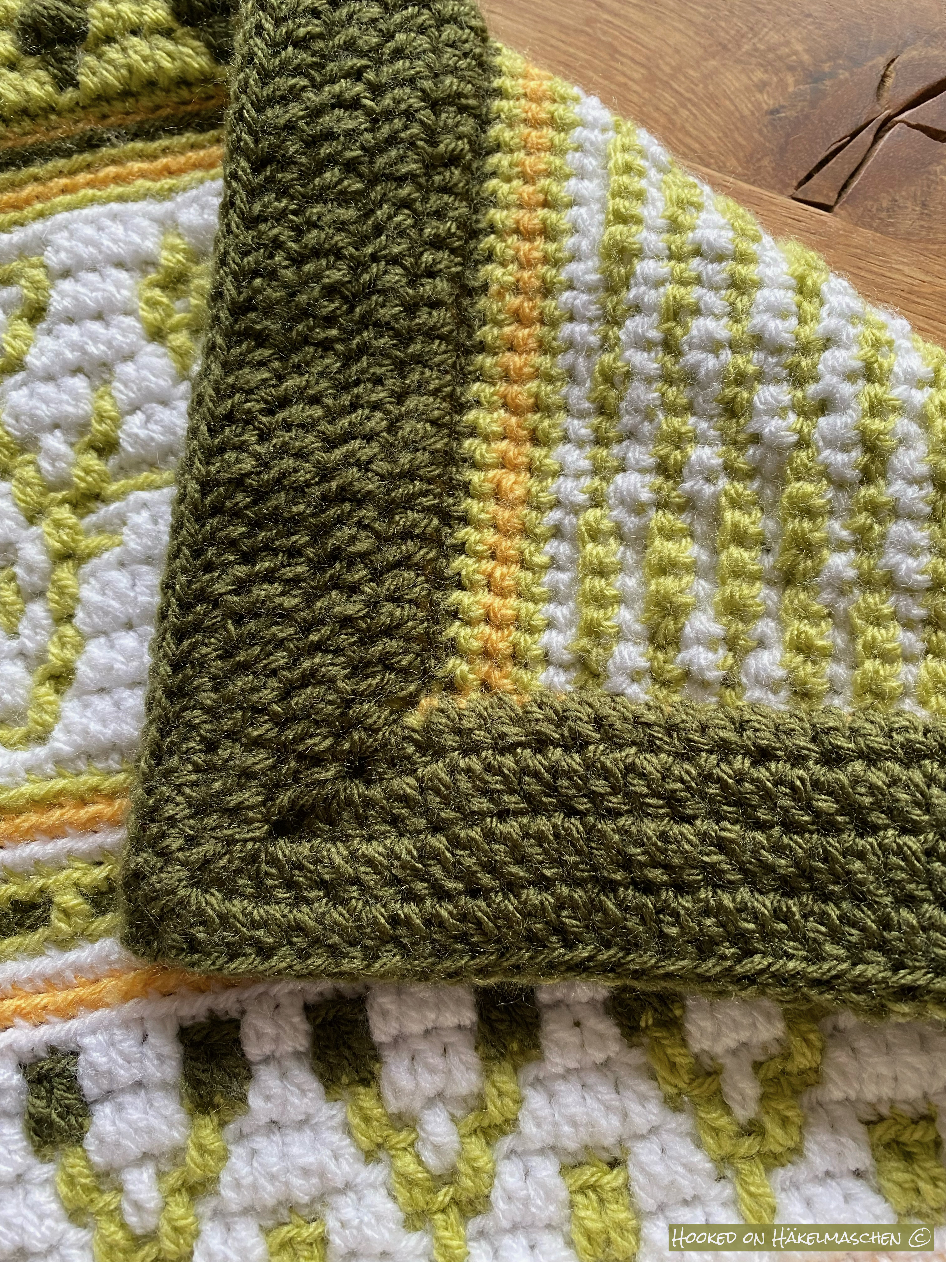
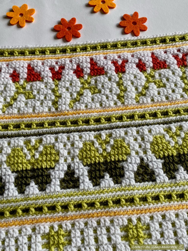
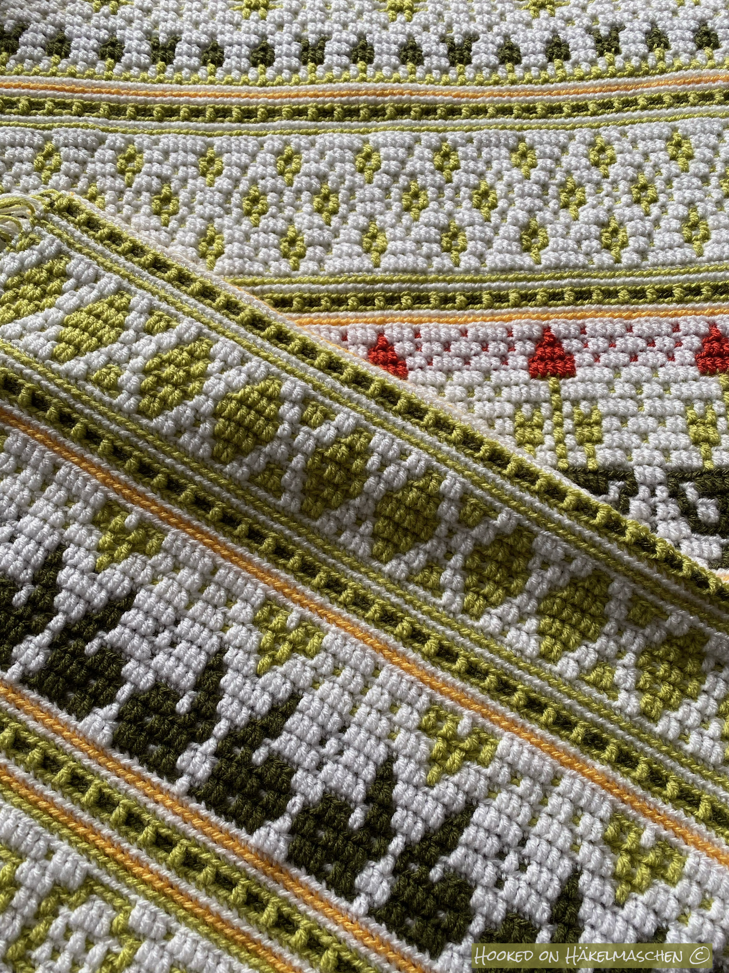
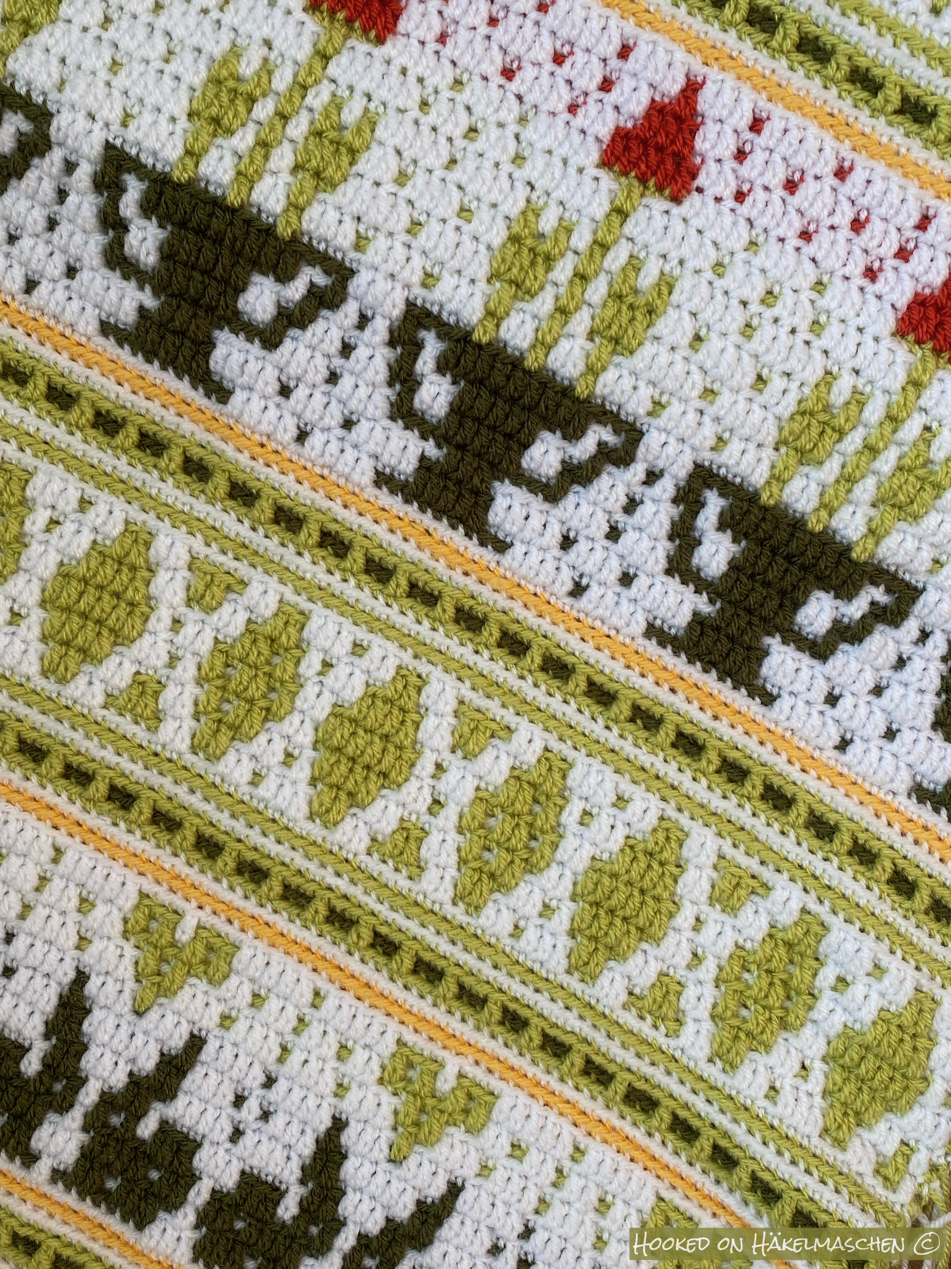
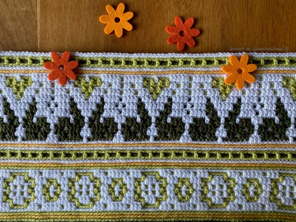
Hello Spring Cal comes to an end now, only the border needs to be done.
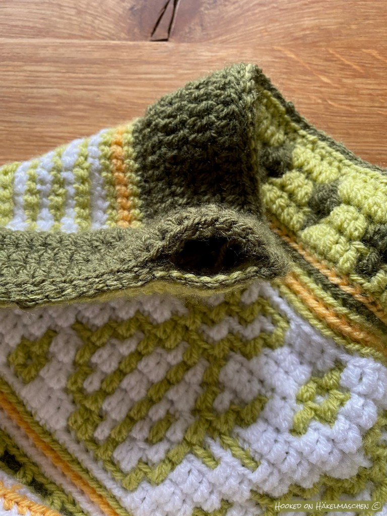
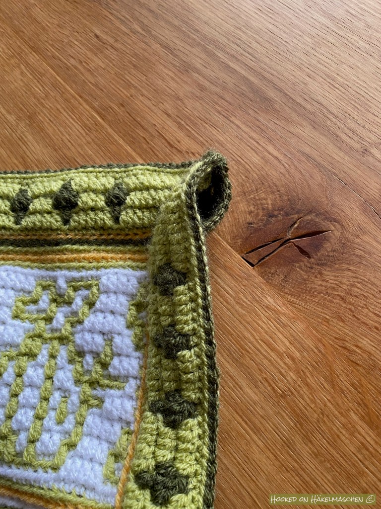
If you follow my blog, you already know that I made a wall hanging working the Hello Spring pattern over 5 pattern repeats. When it came to the border, I finally had to decide how I wanted to hang it up. I have seen quite complicated looking constructions to hang a wall decoration, but I had no idea how to do it. At first I thought about attaching loops to it like a quilt, but even then I wasn’t sure how best to attach them. Then I had another idea, a very easy one:
I worked the border as normal. In the final joining round I left a piece open on the upper side edges. On the last 7 stitches on both upper sides I worked the slip stitches only on the front layer without joining the two layers. The corner is worked as normal. This has created a kind of tunnel through which you can push a rod. It works perfectly!
My colours for the border
Long overdue update, July 2024: I have finally redesigned the documents for my colour scheme and combined the download into one file. Please don’t be surprised that the files look a little different, the content is the same.
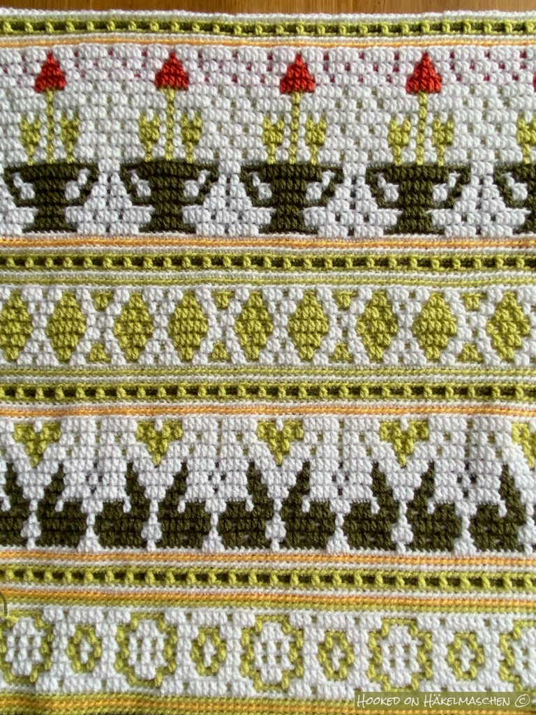
Part 5 of the Hello Spring Cal is out. It is the last part of the blanket body. So it’s almost done. Next week the instructions for the border will follow.
Next week I will show you how I made the mounting for the wall hanging. Add on I will list my yarn amounts.
Here a few impressions of mine:
My colours Part 5
Long overdue update, July 2024: I have finally redesigned the documents for my colour scheme and combined the download into one file. Please don’t be surprised that the files look a little different, the content is the same.
How do you choose colours for a new project? Do you like to go to a yarn shop and hold the balls to each other? Do you have colour samples of your favorite yarns?
I love shopping in yarn shops but unfortunately the DK yarns I like to use for my blankets are not available in my local shop. So I mostly order my yarn online. But ordering online means that you never know how close the colours you see on the screen come to reality. Especially when ordering yarn for a specific project it is more than annoying when the colours are not as you imagined them. I often went wrong!
After several failures I got myself shade cards of my favorite yarns. They helped me a lot! I can now see the colours in reality! And above all I can now better assess how close – or far – the representations on the various websites are to reality. The disadvantage of shade cards is that they quickly can become outdated as new colours are added (and others discontinued).
And unfortunately you cannot place the colours on a shade card next to each other like you would in a yarn shop. My imagination often doesn’t go so far that I can put several colours together in my head and say whether they look good together or not. With 2 or 3 colours it works quite well, but with 5 or more it is usually difficult.
Virtual yarn balls
With the help of my shade cards I found out that for example the display of colours of Stylecraft yarns is very good on their website (at least on my devices). This has opened up new possibilities for me. I downloaded the Special DK colour swatches from there and am now combining them in an app which I also use for collages.
It is great to play around with. You can easily try out colour combinations, move the patterns around, add or change colours. I love it.
This sample was inspired by a mood board of Pipin Poppycock. I used this combination of Stylecraft Special DK for a – still top secret – project and am very happy of how it turned out.
Stylecraft Yarns has kindly allowed me to publish these swatches, mentioning the brand.
„Hardware“
Unfortunately, it should not be underestimated how some colours change in combination with others. Silver, for example. In my Winter Wonderland blanket, in combination with white and other greys, it looks really silver. In the combination shown above, with different shades of apricot and rose, it looks more bluish. At least for me, these effects are difficult to predict on the screen. I can imagine them better when I actually have the colours in front of me, in reality … My lack of imagination again …
That’s why I looked around for other options.
I’m actually really keen on those beautiful yarn pegs that you see everywhere on the internet. But all the ones I’ve found so far are pretty expensive – not for the pegs but for the shipping costs to my country. So I came up with the idea of making a few swatches myself – initially with the colours from my stash.
First I got myself little plastic cards. They are about 3 x 4 cm . I like them, especially as they came in a small box where they can be safely stored.
Unfortunately they only offer little space for labelling. It is difficult to put all the necessary information such as brand, colour number and name on it. I therefore had to use abbreviations for the yarn brand. As my list of shortcuts grew longer and longer I decided to use them only for my thinner cotton yarn.
One day I saw a post by a lady who creates beautiful scrapbooks for her projects. I have unfortunately forgotten her name, otherwise I would credit her here. She had made little crochet squares that she could pin back and forth as she wished. This gave me the idea to do the same to put my colours together – without a scrapbook though.
These squares are also ideal for playing with, trying out and photographing colour combinations and so on. Without having a scrapbook the only problem is the allocation of details such as brand and colour code. At first I thought about labelling each square with a small label so that I could write down all the important details. But somehow that was too impractical for me.
So I switched to wooden sticks. I label them with shade number and name and wrap the thread around them. This is done in no time and there’s enough space on the back of the stick to write down the brand. Some people might see this as “double”, but it has worked perfectly for me so far.
My pile is growing, even though I’m not finished yet. I had no idea that I already had so many colours in my stash. Every very time I order yarn now, I pick an extra ball of one or two colours that I don‘t have yet but might use in one of my future projects. I’m well on my way to building up my own collection!
Week 4 of the Hello Spring Cal starts, now it is already half way done. One more part will follow next week and then it will be border time!
Just two more pictures this week – again, not the best quality! Again we had a long period of bad weather! Sorry!
And here my colours
Long overdue update, July 2024: I have finally redesigned the documents for my colour scheme and combined the download into one file. Please don’t be surprised that the files look a little different, the content is the same.
It is already week 3 of the Hello Spring Cal. The time flies! However, I just felt thrown back a few weeks. We haven’t had that much snow for years. This is our old pine tree on Saturday morning, 02.April 2022. Hello Spring!
But I don’t want to miss to share
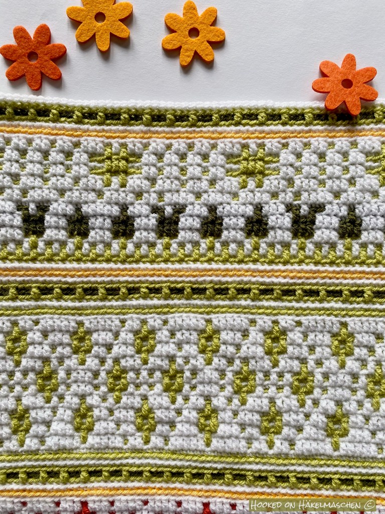
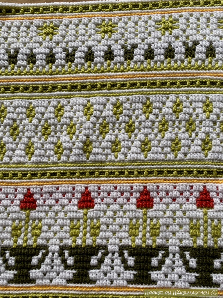
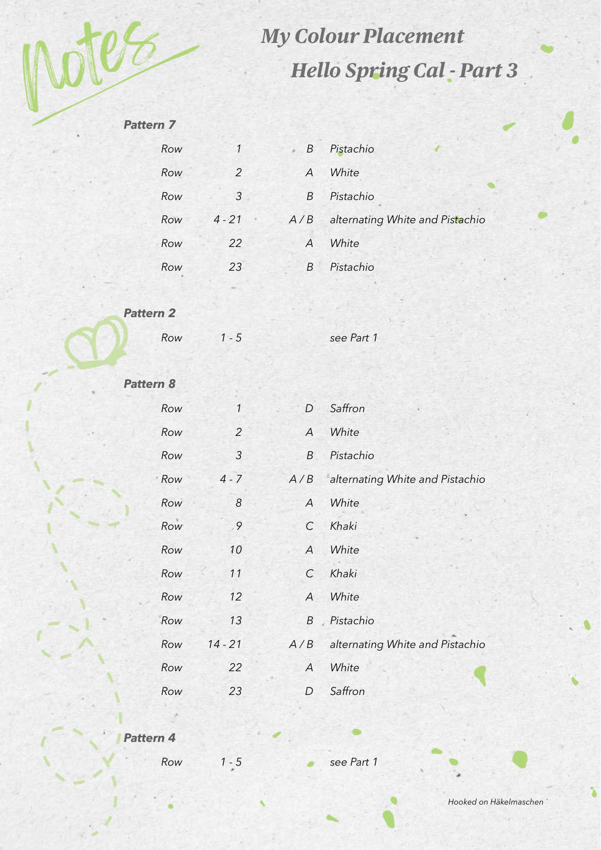
My colours Part 3
Long overdue update, July 2024: I have finally redesigned the documents for my colour scheme and combined the download into one file. Please don’t be surprised that the files look a little different, the content is the same.
Just in time for the start of the second part of the Hello Spring Cal I would like to show you my part 2 and share my colour placement..
But first …
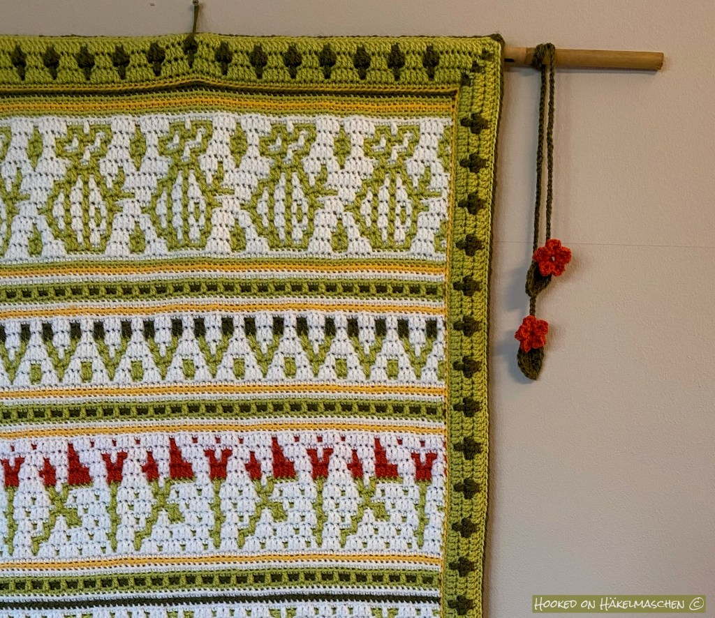
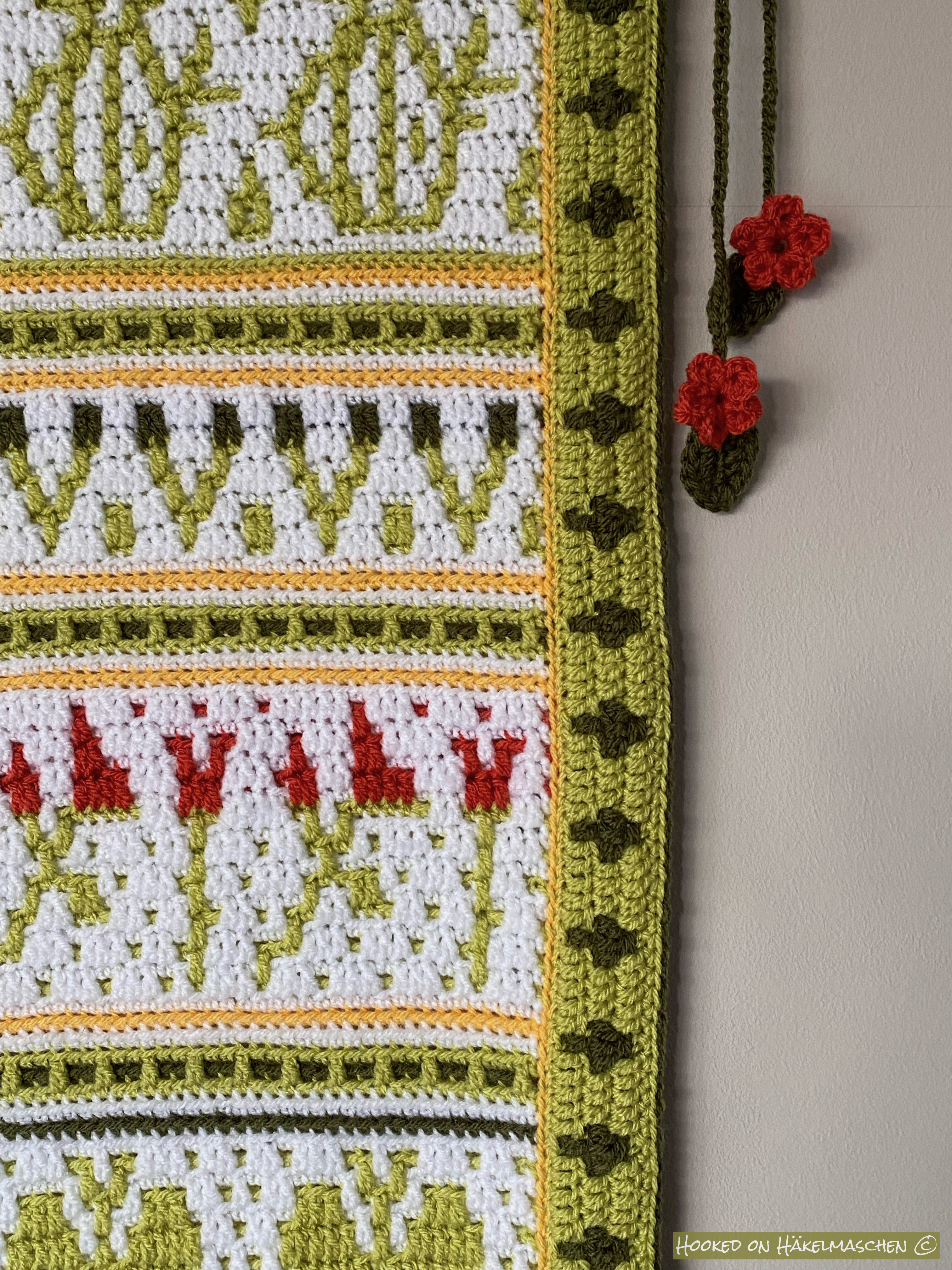
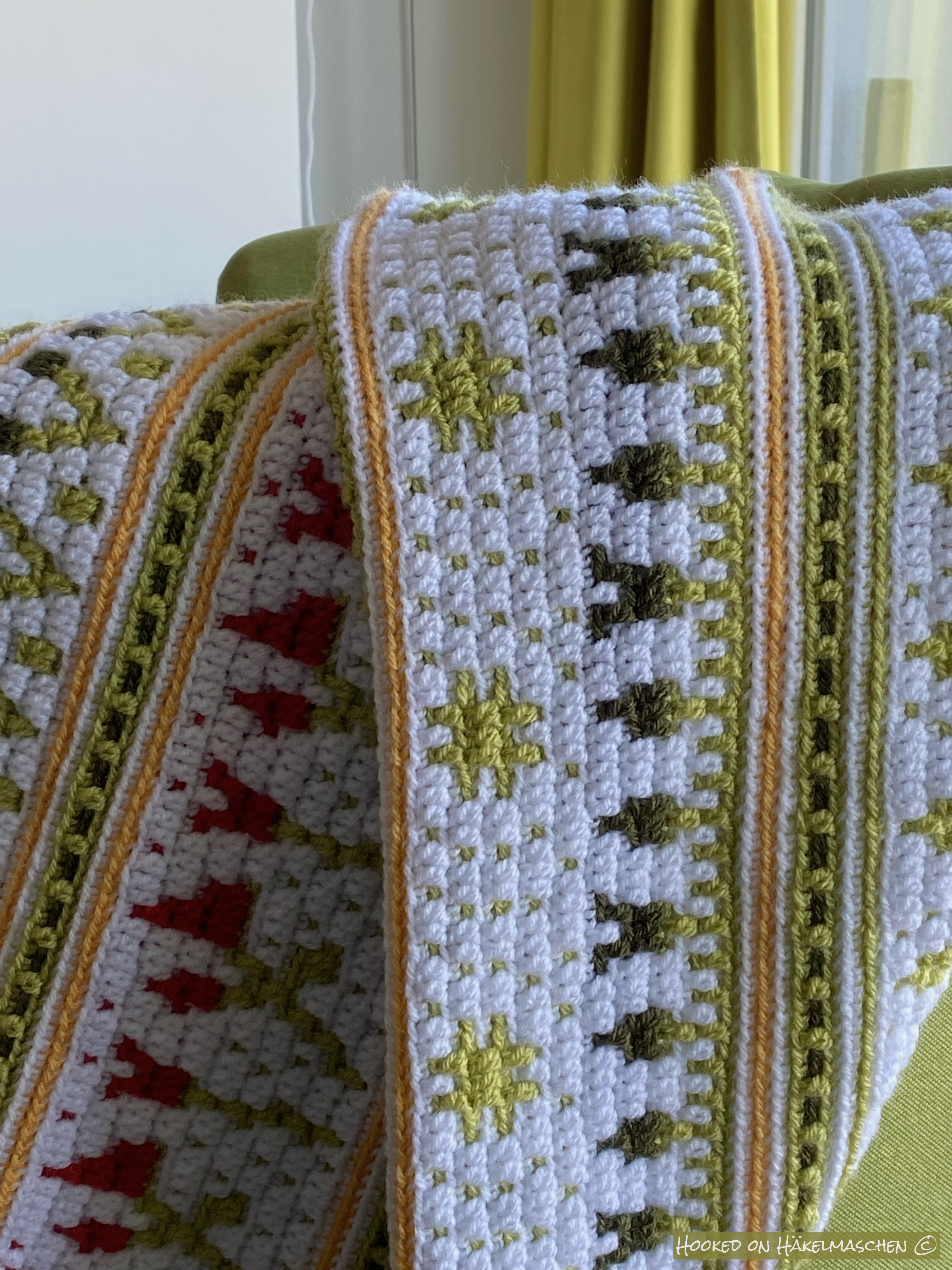
… I‘d like to show you my finished wall hanging.
I worked over 5 repeats and it is about 60 cm (24 inch) wide.
It will be a decoration in our hall. Unfortunately it is too dark there to take a good photo. The colours are hard to capture anyway!
My colours part 2
According to my original plans, I only wanted to use 4 colours for my wall hanging – mainly White, Khaki, Pistachio and a little Saffron to spice it up. In part 2 I changed my mind!
The picture below shows my first attempt on part 2. Probably a bit too much Khaki?
And here my second version, after playing a bit with Tomato
My colour placement:
Long overdue update, July 2024: I have finally redesigned the documents for my colour scheme and combined the download into one file. Please don’t be surprised that the files look a little different, the content is the same.
Since some people have asked me about it, yes, I will post my progress, parts and colours here. So let us begin with my
Yarn and colours
I used Stylecraft Special DK and a 4 mm hook. My colours are
1001 White
1822 Pistachio
1027 Khaki
1081 Saffron
1723 Tomato
When I saw Ana‘s pattern I actually had a different colour scheme in mind and my first approach was slightly different. But somehow it didn’t work, even thoughI tried two different colour placements. I had the feeling that it might be a bit dark for a spring theme. At the same time, I had no idea how to proceed with the colour placement. That’s why I discarded it.
Nevertheless, I LOVE these swatches. I haven’t frogged them yet and will keep them as inspiration. I know for sure that I will use these colours some day!
While looking for other colour combinations, I came across a drawing with stylised flowers in two different shades of green on a white background. Somehow that said >Spring< to me. To achieve this look I choose White and Pistachio as main colours and added a little bit of Khaki. Spiced up with a few splashes of Saffron and Tomato.
And here are the colours I used for part 1
Long overdue update, July 2024: I have finally redesigned the documents for my colour scheme and combined the download into one file. Please don’t be surprised that the files look a little different, the content is the same.
The days are not only getting a bit longer but also a bit warmer. The first bushes and trees are sprouting and the sparrows are preparing their nests under our roof. Spring is coming in the northern hemisphere!
Ana from One Skein of Love is celebrating the season with her Hello Spring Cal. Another project that has kept me busy in the last weeks, between Midnight Snowflakes, sock knitting, a short holiday and „normal” life.
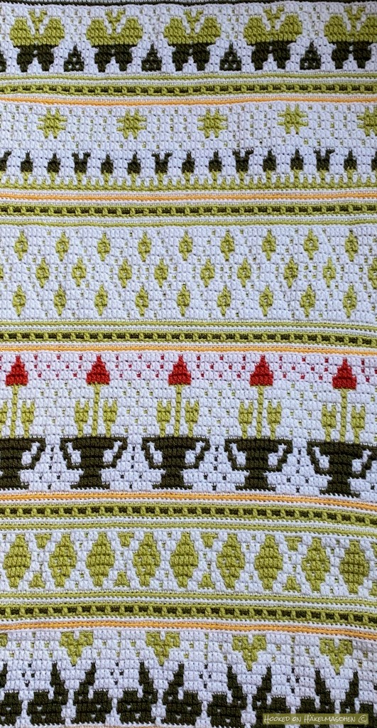
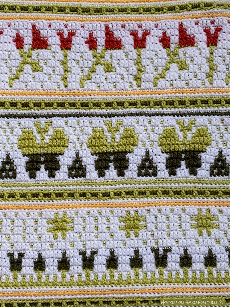
I started testing the Hello Spring Cal in early February. The pattern is designed as a blanket and – similar to Winter Wonderland – consist of different designs that can be combined in various ways. Due to time constraints I only worked 5 repeats this time – it will be a beautiful wall decoration when I am finished.
My colours were inspired by a drawing I found on the internet: flowers in two or three different greens on a white ground. They looked so fresh and airy and reminded me immediately of spring. Unfortunately I cannot share it here due to copyrights but I tried to copy this look using Stylecraft Special DK from my stash.
I used mainly White and Pistachio combined with Khaki and a little bit of Saffron and Tomato.
The Cal will start next Monday, 21. March 2022 and runs for 6 weeks. More information and of course also the pattern are available in Ana’s Ravelry store.
Due to the lovely holiday we had last week I am still working on the border but I hope to show you more next week!
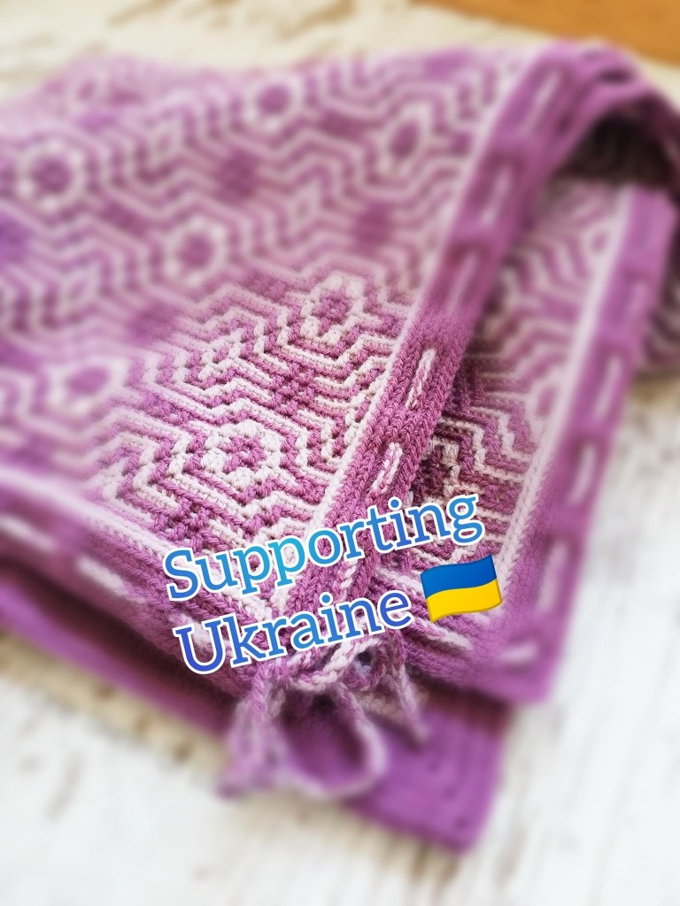
Ana donated € 550 to UNICEF and € 550 to Red Cross. Both organizations support the Ukraine during this terrible war. The donation was made on March, 14.
Thank you so much for your support 💙💛💙💛💙
I just have to share this with you:
Yesterday Ana Morais Soares from One Skein of Love started a campaign on her Facebook group to raise money for Ukraine.
100 % of the money from the sales of her pattern All we need is a Hug will be donated to UNICEF and Doctors without Borders (Médecins Sans Frontière).
These two organizations support Ukrainian citizens during the war. Unicef is trying to help with food and water that is missing in many places there. They also care for children who have to flee with their families or have been separated from their parents. Doctors without Borders helps with working in hospitals or all kind of medicines and health materials that are missing badly.
Ana’s campaign will run until Sunday, 13. March 2022. I think it is a great idea to support these organizations and got my pattern copy yesterday.
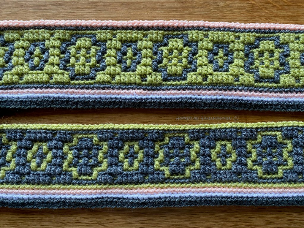
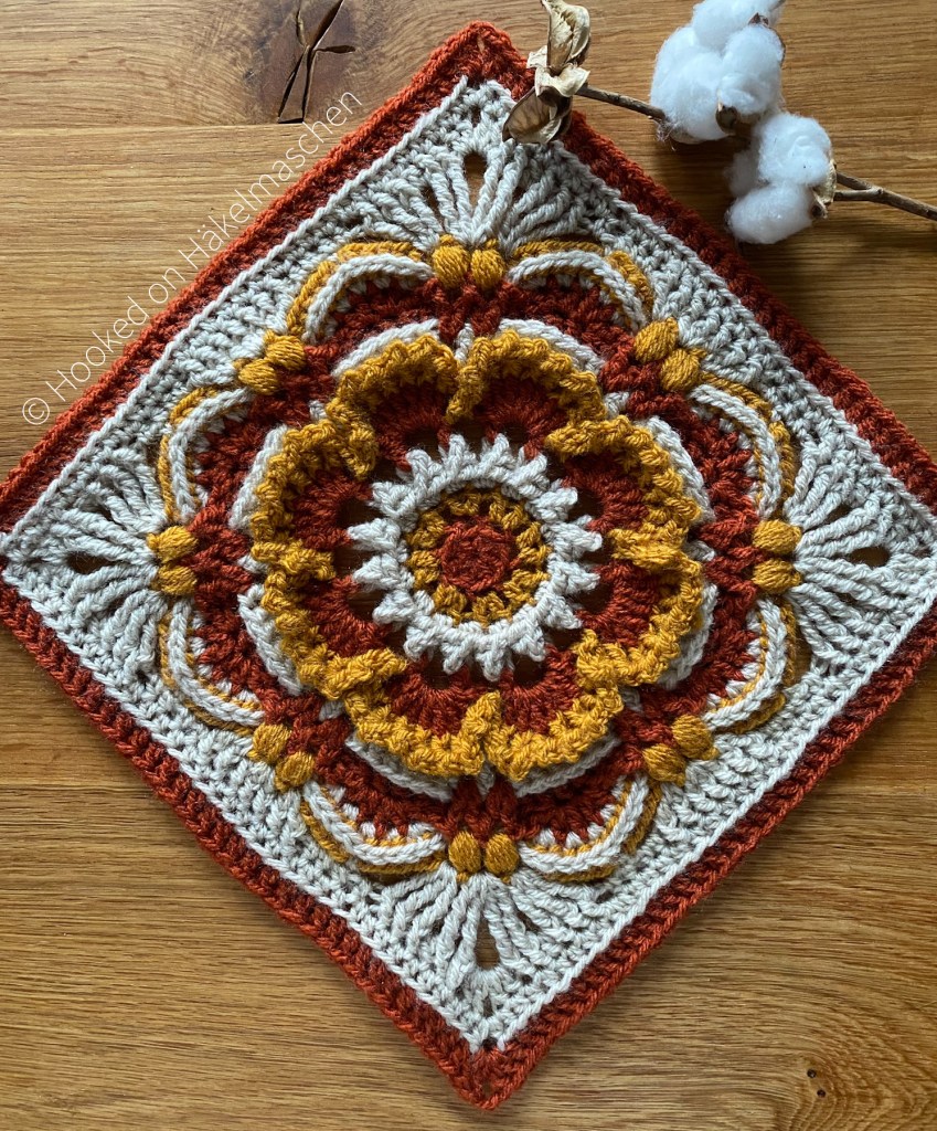
While revising my Pattern Tests page I noticed that I still haven‘t shown my Fancy Nancy square. Shame! So I thought I would write a quick post to catch up!
Fancy Nancy is a design by Pam Knighton-Haener from a Yarn of Serendipity. I tested this pattern already in October last year.
Normally her squares are designed to use an Aran cotton yarn. I must confess not exactly my favorite yarn. At least I haven‘t found one I like to work with yet. So this time I decided to try my standard acrylic DK yarn. Just to see how it works.
I used Stylecraft Special DK in Copper, Parchment and Gold, my favorite autumn colours. I followed her colour scheme 2 and only switched the colour for the last round.
With Aran the squares should be 28 cm (11 inch) or about 30 cm (12 inch) depending on the hook size. With DK yarn my Fancy Nancy became 25 x 25 cm (about 10 inch) tall.
I am very pleased with my result although I assume a cotton yarn would work better. Pat uses a lot of trebles and double trebles in her patterns. These stitches just look better when they are blocked. Unfortunately I still have problems to block acrylic yarn properly.
Fancy Nancy Square
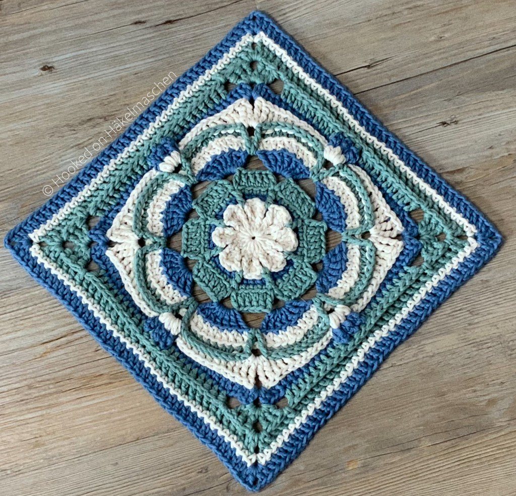
I started testing for Pam in September 2020 and since then had the opportunity to test four of her lovely squares. Well, five, to be correct! I just finished testing her latest design. The pattern has not been published yet, so I cannot show it. But what I can show again are the squares I have made so far.
Carter Jude SquareMargaret SquareBrood of Angels
Maybe I should get some suitable cotton yarn and make some more? One day it would make a beautiful blanket.
All of Pam’s designs are so rich in texture, they would even look great in a solid colour.
If you would like to try one of Pam’s designs just visit her Ravelry store. She also offers some of her patterns for free, have a look!