

Earlier this month, I had the pleasure of testing another design by Pam Knighton-Haener from A Yarn of Serendipity: the Tickle Me Pink Square!
I have to admit, I was a bit curious about the name as I’d never heard that expression before. Of course, I looked it up on Google. If, like me, you’re not a native speaker either, it means to be delighted or overjoyed about something.
Pam’s new pattern is now available on Ravelry and on her other platforms. You will find a link to Ravelry at the end of this post.
The pattern
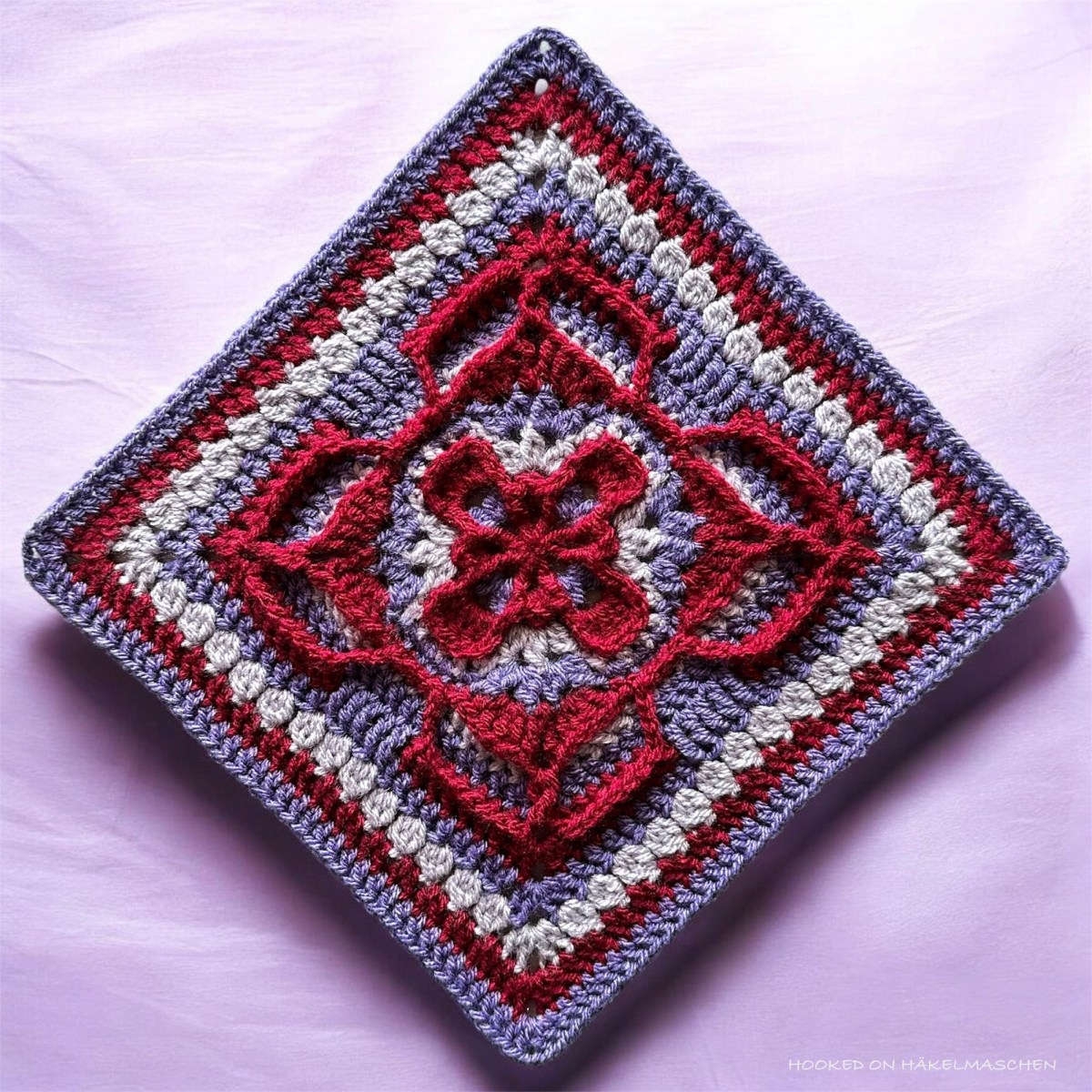
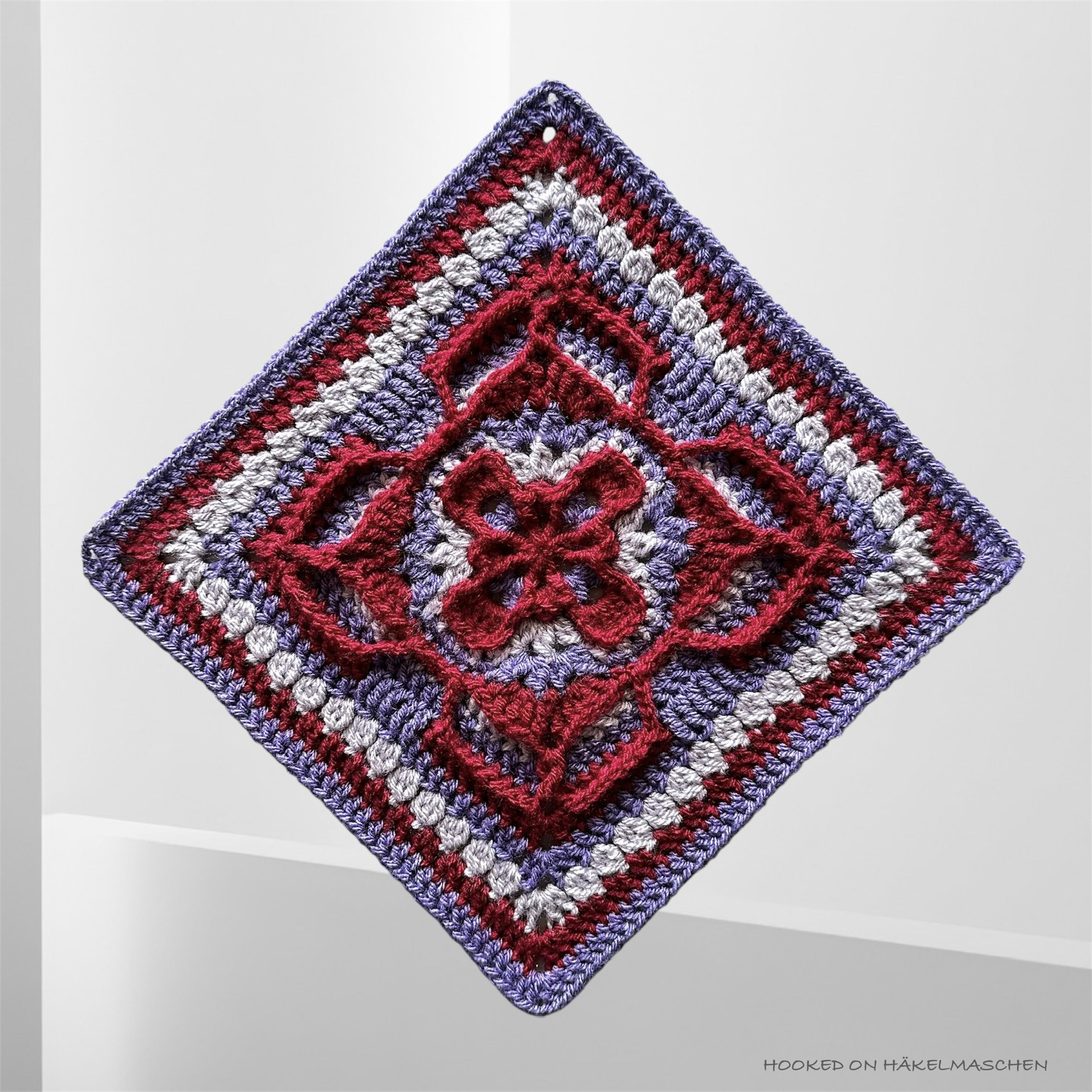
Tickle me Pink is another stunning Afghan square. It matches Pam’s other designs perfectly in both style and size, so you can mix and match them however you like.
The design reminds me a bit of Art Nouveau, the “Modern Style” of the late 19th century.
The crochet square is designed using a #4 Cotton yarn (Aran / worsted weight). And, as always, the size is a bit adjustable by using either a 4.5 or 5 mm hook. Depending on this, the finished measurements are 11 or 12 inches (28 or 30.5 cm).
The pattern is rated with an intermediate skill level and has all Pam’s usual features like
- written in US terms
- two different colourways to follow (one with three and another one with four colours)
- detailed explanation of all the stitches used
- clear and detailed photos for each round that show the exact placement of the stitches
- easy navigation between written instructions, stitch definitions, and photos
My test version of the Tickle Me Pink Square
Again, I went with Stylecraft Special DK for my test version as it’s the yarn I currently have the widest colour selection in.
Stylecraft Special DK is 100% Acrylic and has 295 m/100 g (size #3 – Double Knit, Light worsted).
I worked with a 3.75 mm hook and my finished square turned out about 24.5 cm (about 10 in).
Colours, colours, colours
What colour do you choose when a design is called ‘Tickle Me Pink’?
Pam had already gone for shades of pink for one of her colour variations, so I wanted to show something different.
Somehow, I had the feeling that bold colours would definitely work well for this design. So I opted for a combination of Violet, Claret and Parma Violet. A combination that’s completely outside my comfort zone – ugh!
Don’t ask me how I ended up choosing Violet. It’s a colour I rarely use because I find it hard to pair with others. Neutrals such as white or cream often create too much contrast. Combinations with yellow (the complementary colour of violet) or green (a secondary colour) seem quite popular. But personally, I don’t like either of those. I do like the combination of violet and orange (the other secondary colour), but only if orange is the dominant colour. All in all, that doesn’t leave many options!
So, at first I was quite hesitant about my colour choice, but then decided to just give it a go. What can I say? I think the result is really, really good! Strong but pretty! Although I’m sure the design will look good in soft, pastel colours too.
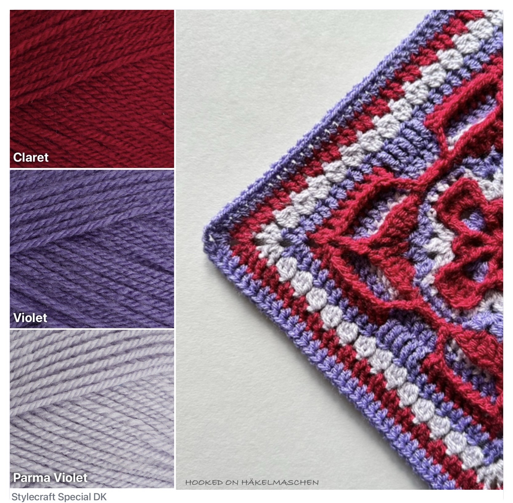
- A – 1123, Claret
- B – 1277, Violet
- C – 1724, Parma Violet
I followed Pam’s colourway 1 and replaced the colours like shown in the photo above.
My conclusion
All in all, this was another pattern I really enjoyed working on. The design is beautiful and well thought out, but what I liked most this time was stepping a little outside my usual colour choices.
It’s always interesting to see how different colour combinations can completely change the look of a design – and this one definitely proved that to me.
Pattern link
In case I’ve sparked your interest
Tickle Me Pink Square on Ravelry
Happy crocheting 💕


One thought on “Tickle Me Pink – A Bold Take on Colour”